Logo + Website for SpecAbilities
Project Summary
Neurodiversity consulting is a field built on expertise, empathy, and trust. Lindsay Weiner founded SpecAbilities with 20+ years of experience as a BCBA and special educator, helping neurodiverse students and families navigate the transition from school to adulthood and helping employers build more inclusive workplaces. What she needed was a brand and digital presence that matched the sophistication and warmth of the work she does every day.
The goal was to build a visual identity and website from the ground up that felt both credibly professional and genuinely approachable, so families in one of their most vulnerable moments and employers navigating new territory would feel immediately at ease.
The Challenge
Standing Apart in a Clinical Space: The neurodiversity and special education space tends toward sterile, clinical visual identities. SpecAbilities needed to feel warm, modern, and human without losing professional credibility.
Serving Two Distinct Audiences: The brand and website needed to speak clearly to two very different clients: families navigating the transition to adulthood for their neurodiverse children, and employers looking to strengthen inclusion in the workplace. Both audiences had to feel seen from the moment they landed on the site.
Building Trust From Scratch: As a new brand, there was no visual equity to lean on. Every design decision had to work harder to signal expertise, warmth, and credibility simultaneously.
Translating a Complex Mission Simply: Transition planning, college and career readiness, independent living, workplace consulting — the full scope of SpecAbilities' services had to feel clear and accessible, never overwhelming.
Our Approach
Every project at The Branding Den starts with questions before it starts with design. For SpecAbilities, we dug into Lindsay's philosophy, her audience, and the gap between how neurodiversity services typically look and how they could look. Her approach is practical, personalized, and rooted in real-world experience — and the brand needed to reflect all three.
We explored identity directions that balanced structure with warmth, leaning into playful but refined visual elements that felt inclusive and welcoming without reading as childlike. The result was a brand system built around a custom icon family — expressive, character-driven marks that bring personality to the identity while maintaining the polish of a premium consulting firm.
Solution
The SpecAbilities brand identity bridges the gap between high-level expertise and a boutique, human-centered experience.
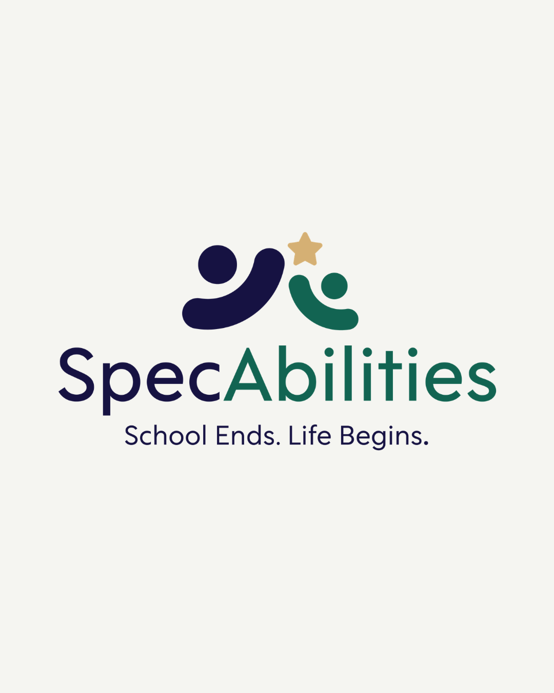
The Logo System: A clean, confident wordmark paired with a distinctive custom icon — a stylized character mark that feels approachable, memorable, and unlike anything else in the neurodiversity space. The mark works beautifully across all applications, from social media avatars to large-scale print.
The Icon Family: A full set of custom character-driven icons that extend the brand personality throughout the website and marketing materials, creating a visual language that feels cohesive and ownable.
The Palette: Navy blue, forest green, and warm gold — a combination that signals stability and expertise while the green and gold bring in the warmth and optimism the brand needed. Nothing clinical, nothing cold.
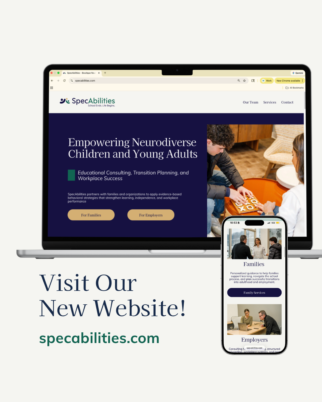
The Website: A clean, structured site built with two clear pathways from the homepage — For Families and For Employers — so every visitor immediately knows they're in the right place. The design is modern and minimal, letting Lindsay's expertise and photography lead. A clear three-step process (Connect, Plan, Grow) demystifies what working with SpecAbilities looks like and lowers the barrier to booking.
The Result
SpecAbilities launched with a visual identity and digital presence that reflects exactly who Lindsay is and who she serves.
A Brand That Bridges Two Worlds: Warm enough for families navigating an emotional season of life. Polished enough for corporate employers making serious hiring and training decisions.
Instant Clarity: A website structure that immediately separates family services from employer services, so no visitor has to wonder if this is the right fit.
A Distinctive Visual Identity: A logo and icon system that stands completely apart from the clinical, generic aesthetic typical of the space.
A Professional Foundation: A cohesive system of colors, typography, and custom graphics that makes every touchpoint — from social media to proposals — feel premium and intentional.