
Your Brand Doesn't Need to Be Prettier. It Needs to Be Unmistakably Yours.
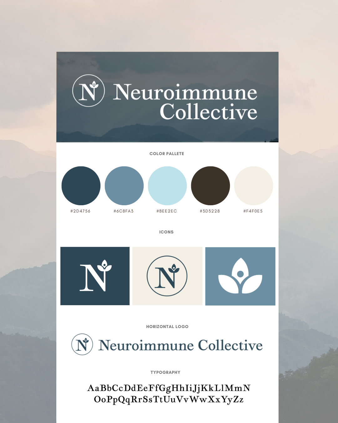
Nobody wants their brand to look like everyone else's and rightfully so. The problem is that everything is starting to blend together: the same fonts, the same color palettes, the same forgettable logos. AI tools have made it easier than ever to produce something that looks nice. They've made it much harder to produce something that looks unmistakably yours.
The Data Behind the Sameness
This isn't just a feeling. A recent study scored 100 B2B SaaS and AI companies against eight distinctive brand assets, the visual and verbal signals that make a brand recognizable without a logo attached. Exactly one company reached the truly ownable band. Seventy-eight were stuck in generic territory. Color was the biggest offender: it scored highest on paper, but when nearly every company in a category nails the same blue, the color stops doing any work at all.
AI is accelerating the drift. Most companies now draft visuals and copy with the same handful of tools, and those tools pull toward the same statistical average. The result is a category where one company's homepage is increasingly hard to tell apart from its competitor's. Brands that actively resist that pull are seeing outsized rewards for it: one analysis found that startups with genuinely distinct branding outperform generic competitors by 15 to 20 percent in customer acquisition efficiency, and brands with a real point of view are earning a disproportionate share of AI-generated recommendations in their category.
Why “Nice” Isn't the Same as “Yours”
Not all brand assets carry equal weight. Shape-based elements — logos, packaging silhouettes, distinctive layout patterns consistently outperform color on both recognition and uniqueness. Color is the easiest thing to copy and the first thing that gets diluted once a whole industry converges on the same palette. Shape, form, and a recognizable point of view are much harder to fake and much harder to lose.
This is also where restraint gets misunderstood. Simple design isn't the enemy, generic design is. The best identities hold onto character even when they're stripped down: an unexpected color pairing, an asymmetric mark, a tone of voice that sounds like an actual person instead of a category average. Some of the strongest rebrands happening right now aren't the loudest ones. They're grounded in real strategy first, then finally given a look that matches the point of view underneath it.
The Real Test Before Your Next Rebrand
Before signing off on a new look, ask one honest question: could a hundred other companies in your category have landed on this exact same result? If the answer is yes, the work probably isn't finished yet. A brand that could belong to anyone effectively belongs to no one.
A few ways to check your own brand against that test:
• Pull up your three closest competitors' homepages next to yours and see if a stranger could tell them apart without the logos visible.
• Audit your palette honestly — if it's a safe blue or a startup-standard gradient, ask what it's actually communicating that a competitor's palette isn't.
• Look at your logo and packaging in isolation, with no color or type. Does the shape alone still say something specific about you?
• Read your last five pieces of marketing copy out loud. If they could be swapped with a competitor's and still make sense, the words are doing the sameness work too.
• Ground any redesign in strategy first: who you're for, what you stand for, and what you're willing to not be. The look should follow from that, not the other way around.
Distinctiveness isn't about being loud for its own sake. It's about making choices deliberate enough that they couldn't have landed anywhere else. That's the work we spend most of our time on at The Branding Den: pairing real strategy with an identity that actually looks like it belongs to the brand behind it, not the category it competes in.